Introduction
Vibe Coding’s practical case reveals a new paradigm in AI programming: constructing a complete personal knowledge management platform with just four natural language instructions. This article showcases the entire process from requirement analysis and data modeling to interface design, demonstrating how to develop a Markdown knowledge base using Cursor, Figma, and Claude. From strategic planning to testing and deployment, AI is reshaping the workflow and collaboration models of traditional software development.

01 Tool Preparation
Before starting the practical work, ensure you have installed and registered the following tools:
1.1 Cursor Installation
Cursor is an AI-based intelligent code editor that integrates powerful large language models to significantly enhance development efficiency.
- Download: Visit the Cursor official website https://cursor.sh
- Install: Run the installer and follow the prompts to complete the installation.
- Configure: On first launch, log in using your GitHub or Google account and set up basic preferences (such as shortcuts, themes, etc.).
1.2 Figma Registration and Client Installation
Figma is the core tool responsible for “interface and interaction” design in this project.
- Register: Visit the Figma official website https://www.figma.com/
- Install Desktop Client: It is highly recommended to download and install the Figma desktop client, as some advanced developer features (like local MCP Server interaction) must run locally on the desktop client.
1.3 API Access
Access the API for Claude code/codex integration at https://www.aicodemirror.com/register?invitecode=W41BC7
02 Practical Steps
This practical exercise will build a Markdown-supported personal knowledge base web version from scratch using AI models, Figma, and Cursor through four core steps.
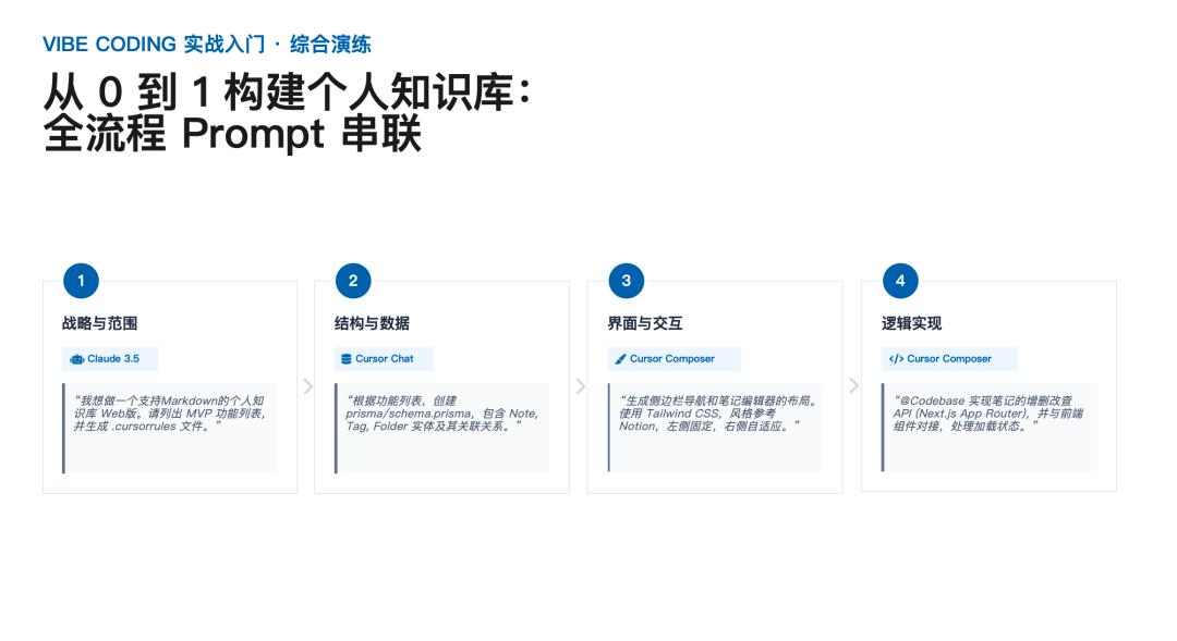
Step 1: Strategy and Scope (Requirement Analysis)
Tools Used: Claude 3.5 (or Cursor built-in model)
In this phase, we need to clarify the core goals and basic functionality of the project.
- Instructions: In the Cursor chat window, select Claude 3.5 and input the following prompt:
- “I want to create a Markdown-supported personal knowledge base web version. Please list the MVP (Minimum Viable Product) feature set and generate a .cursorrules file.”
- Expected Result: The AI will outline the core MVP features (such as creating, editing, and categorizing notes) and generate a project-specific .cursorrules file to standardize the style of subsequent AI-generated code.
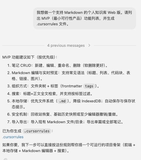
Markdown Personal Knowledge Base Web (MVP Feature List)
Following the MVP (Minimum Viable Product) principle: only implement the minimum features required to validate core value. Core value: Users can create, edit, save, and read Markdown notes.
1. Core Features (P0)
-
Note Management
- Create notes
- Edit notes
- Delete notes
- Display note list
-
Markdown Editing
- Edit Markdown text
- Support basic Markdown syntax
- Headings
- Bold/Italic
- Lists
- Blockquotes
- Code blocks
- Links
-
Markdown Preview
- Render Markdown display
- Split view for editing and preview
- Real-time preview
-
Note Viewing
- Open notes on click
- Display in reading mode
-
Data Storage
- Local data storage (browser local)
- Automatically load notes after page refresh
2. MVP Feature Overview
| Module | Feature |
|---|---|
| Note Management | Create notes |
| Note Management | Edit notes |
| Note Management | Delete notes |
| Note Management | Note list |
| Markdown Editing | Markdown editing |
| Markdown Editing | Basic Markdown syntax support |
| Markdown Preview | Real-time Markdown rendering |
| Note Viewing | Reading mode |
| Data Storage | Local storage |
Total MVP Features: 9
3. Features Excluded from MVP (Intentionally Omitted)
To ensure development efficiency, the following features will not be included in the MVP:
- Folder/Directory management
- Tag system
- Full-text search
- Image uploads
- Cloud synchronization
- Multi-user accounts
- Collaborative editing
- AI features
- Plugin system
4. MVP Product Interface Structure
---------------------| Note List | Edit Area | Preview Area |
---------------------
5. MVP User Core Flow
Open System ↓ Create Note ↓ Edit Markdown ↓ Real-time Preview ↓ Auto Save
To make this project more like a real product rather than a practice project, the next steps typically involve designing:
- V1 Feature Expansion List (10 features)
- Complete Knowledge Base Product Architecture (similar to Obsidian)
- Database Structure Design
- Frontend Page Information Architecture (IA)
This can directly upgrade the project to a complete product prototype.
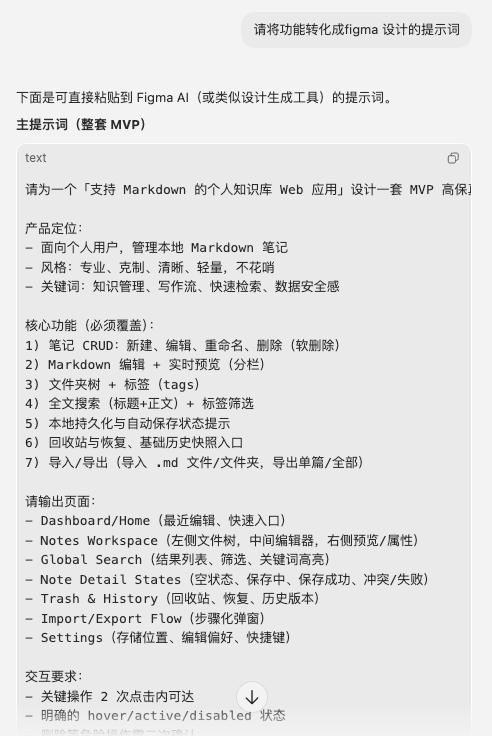
Figma Page Design Prompts (Markdown Personal Knowledge Base Web)
The design goal is to design only the minimum necessary pages around MVP features.
1. Overall Product Design Prompt
Prompt:
Design a simple web application interface for a personal Markdown knowledge base. Product features:
- Targeted at individual users
- Supports Markdown note editing and reading
- Interface style is simple, modern, and developer tool-oriented
Overall layout: three-column layout
1. Left: Note list
2. Middle: Markdown editor
3. Right: Markdown preview
Design requirements:
- Style similar to developer tools
- Simple and modern
- Ample white space
- Use light theme
- UI style close to technical product pages
Page width: 1440px
Font:
- Title: 16-18px
- Body: 14px
- Monospace font for code
Color style:
- Primary color: blue
- Background: light gray
- White for edit area
Components needed:
- Top navigation bar
- Note list
- Markdown editing area
- Markdown preview area
- New note button
2. Main Page (Core Page) Prompt
Prompt:
Design the main page of the Markdown knowledge base web application. Page layout:
Top navigation bar - Product name: Knowledge Base - Search box - Settings button
Main body in three-column layout:
Left (240px) Note list area:
- New note button
- Note list
- Current note highlighted
Middle (Markdown editing area):
- Markdown editor
- Supports multi-line input
- Uses monospace font
- Similar to code editor style
Right (Markdown preview area):
- Rendered Markdown content
- Titles
- Lists
- Code blocks
- Blockquotes
- Links
Visual style:
- Similar to developer tools
- Simple
- Ample white space
3. Note List Component Prompt
Prompt:
Design a note list component. Component content:
Top - New note button
List content:
- Note title
- Creation time
- Currently selected note highlighted
Interactions:
- Hover state
- Selected state
Design style:
- Similar to IDE file list
- Simple
- Vertical list layout
4. Markdown Editor Component Prompt
Prompt:
Design a Markdown editor component. Component features:
- Large text input area
- Monospace font
- Supports multi-line input
- Similar to code editor
Interface elements:
Top toolbar:
- Bold button
- Italic button
- Insert link button
- Insert code block button
Edit area:
- Raw Markdown text
- Auto line wrap
- Comfortable line spacing
Style:
- Developer tools style
- Simple
- No complex decorations
5. Markdown Preview Component Prompt
Prompt:
Design a Markdown preview area. Display content:
- H1 / H2 / H3 titles
- Paragraphs
- Lists
- Code blocks
- Blockquotes
- Links
Visual effects:
Titles:
- H1 large font
- H2 medium font
Code blocks:
- Gray background
- Monospace font
Overall typography:
- Comfortable for reading
- Similar to technical documentation
6. Empty State Page Prompt
Prompt:
Design an empty state interface. Scenario: User has not created any notes yet. Interface content:
- Illustration (simple document icon)
- Prompt text: "No notes yet, click new to start recording"
- New note button
Style:
- Simple
- Centered layout
- Ample white space
7. Recommended Figma Page Structure
Create the following pages in Figma:
01 Layout
02 Components
03 Main Page
04 Empty State
Component library:
Button
Sidebar
Editor
Preview
Note Item
Navbar
8. Recommended UI Style References
You can refer to the following products for UI style:
- Obsidian
- Notion
- VS Code
Design style keywords:
developer tools
minimal
clean
markdown editor
knowledge management
If you continue to optimize this project, I can provide you with a set of advanced design prompts:
A complete Figma Design System prompt (buttons/input boxes/list components)
Super prompts for AI to automatically generate complete web UI (generate the entire product at once)
Complete page structure for Markdown knowledge base product (close to Obsidian architecture)
This way, you can basically generate a complete UI prototype in 5 minutes.
Step 2: Structure and Data (Data Modeling)
Tools Used: Cursor Chat
After clarifying the requirements, design the data structure of the system.
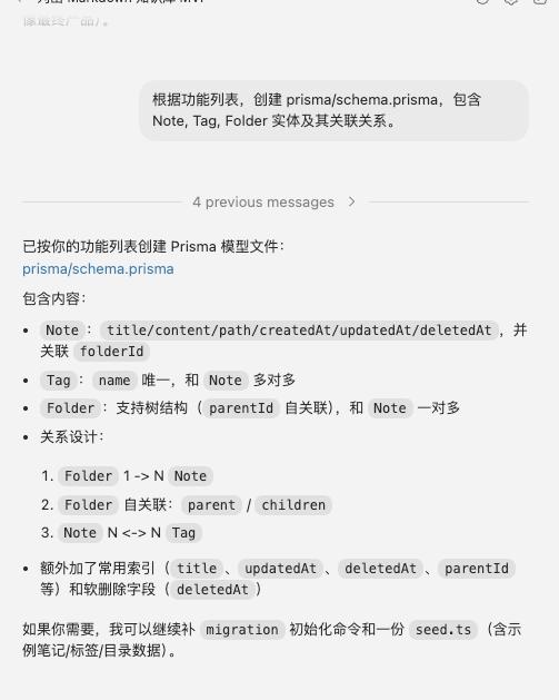
- Instructions: Continue in Cursor Chat and input the following prompt:
- “Based on the feature list, create prisma/schema.prisma, including Note, Tag, Folder entities and their relationships.”
- Expected Result: Cursor will generate a Prisma-based database model definition file, clarifying table structures and foreign key relationships.
Step 3: Interface and Interaction (Figma Design and Code Import)
Tools Used: Figma (Dev Mode/plugins) + Cursor
In this phase, we will complete the visual design in Figma and convert the design drafts into code files to import into Cursor. Here are two mainstream paths you can choose based on team habits and project complexity:
3.1 Complete Interface Design in Figma
- Open Figma and create a new file, designing a classic layout similar to Notion: a fixed left navigation bar and a responsive editor area on the right.
- Design specifications: It is highly recommended to use Auto Layout, standardized Components, and Variables, which can greatly enhance the quality of exported code.
3.2 Path One: Directly Download Code Files via Figma Plugin (Recommended for Quick Start)
If you want to directly obtain complete React/Tailwind/HTML code files, using third-party conversion plugins from the Figma community is the most efficient way.
Steps:
- Install Plugin: Click Resources (Shift + I) in the Figma top menu -> Plugins, search for and run mainstream Code Export plugins (like Anima, Figma to Code, Builder.io, or Locofy).
- Select and Convert: Select the designed interface Frame, and in the plugin panel, choose the target framework (like React + Tailwind CSS).
- Download Code Zip: After the plugin parsing is complete, it usually provides a Download ZIP or Export Code button. Click to download, and you will receive a compressed package containing complete component code, CSS styles, and static resources (images/SVG).
- Import into Cursor: Unzip the downloaded ZIP file. Open your project in Cursor, and drag or copy the unzipped code files (like .jsx, .tsx, .css) directly into the project’s components or app directory. Copy static resource files into the project’s public directory.
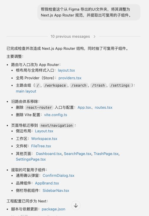
- Fine-tuning and Integration: In Cursor Composer, input the prompt to have the AI help you integrate these static components with your project architecture:
“@
Help me check this React component exported from Figma, adjust it to Next.js App Router standards, and extract reusable subcomponents.”
3.3 Path Two: Copy/Export CSS and Resources via Dev Mode (Suitable for Accurate Restoration)
If you only need to extract core styles, variables, or image resources, Figma’s native Dev Mode is the best choice.
Steps:
- Enable Developer Mode: Click the Dev Mode switch in the upper right corner of Figma (shortcut Shift + D).
- Extract Code Snippets: Select any layer or component, and the right-side Inspect panel will display detailed information. In the Code area, you can choose the language (CSS, iOS, Android) and directly copy the generated CSS or Tailwind code snippets to paste into Cursor’s style files.
- Download Slices and Resources: In the Inspect panel’s Assets area, Dev Mode will automatically identify and extract icons and images. Set the format (PNG, SVG, JPG, etc.) and click the download button to save the resources into the Cursor project’s public folder.
- Use Code Connect (Advanced): If the team maintains a component library, you can use Code Connect in Dev Mode to directly view the real code library reference snippets corresponding to the design components and copy them for use in Cursor.
(Note: Besides the above two methods, you can also configure Figma’s official MCP Server to have Cursor directly read Figma links to generate code.)
Step 4: Logic Implementation (Backend and Integration)
Tools Used: Cursor Composer
The final step is to implement business logic, connecting the imported frontend interface with backend data.
- Instructions: Input the following prompt:
- “Implement CRUD API for notes (Next.js App Router) and connect it with the previously imported frontend components to handle loading and empty states.”
- Expected Result: Cursor will analyze the global project structure, automatically generate API routes, and update the frontend components to call these interfaces, completing full-stack integration.
Step 5: Project Testing
MindMark Manual Testing Report (2026-03-07)
1. Basic Information
- Project: MindMark (Markdown Personal Knowledge Base Web)
- Test Round: R1 (After MVP feature integration)
- Test Date: 2026-03-07
- Test Method: Manual Testing (UI + API)
- Tester: Yiyi
- Version Information:
- Next.js
15.5.12(Webpack) - Node.js
v24.10.0 - Prisma Client
v6.19.2
- Next.js
2. Test Scope
- UI Main Process:
- Note creation, editing, auto-saving, deletion, recovery, emptying recycle bin
- Empty state, loading state, search, settings reset
- API Main Process:
GET /api/notesPOST /api/notesPATCH /api/notes/:idDELETE /api/notes/:idPOST /api/notes/:id/restoreDELETE /api/notes?hard=1
3. Execution Result Overview
- Total Cases: 15
- Passed: 15
- Failed: 0
- Blocked: 0
- Overall Conclusion: The MVP core features have passed this round and can proceed to the next stage (return to automation and experience refinement).
4. Detailed Results
| Case ID | Case Name | Result | Remarks |
|---|---|---|---|
| T01 | Homepage Rendering and Startup Stability | PASS | No white screen, no global-error runtime exceptions |
| T02 | Empty State Display | PASS | Homepage/workspace/search/recycle bin empty state normal |
| T03 | Create Note | PASS | Can create and enter edit state |
| T04 | Auto Save and Refresh Persistence | PASS | Data retained after refresh |
| T05 | Quick Continuous Editing Consistency | PASS | Final content matches last input |
| T06 | Delete to Recycle Bin | PASS | Main list removed, recycle bin visible |
| T07 | Recycle Bin Recovery | PASS | Visible in main list after recovery, content intact |
| T08 | Empty Recycle Bin | PASS | Recycle bin emptied, cannot be restored |
| T09 | Search Hit and Empty Result | PASS | Accurate hits, normal empty state |
| T10 | Slow Network Loading State | PASS | Loading state appears normally under Slow 3G |
| T11 | Settings Page Reset Data | PASS | Restores to default state after reset |
| T12 | API: GET /api/notes | PASS | User feedback passed |
| T13 | API: POST /api/notes | PASS | User feedback passed |
| T14 | API: PATCH /api/notes/:id | PASS | User feedback passed |
| T15 | API: Delete/Restore/Hard Clear Link | PASS | User feedback passed |
5. Risks and Remarks
- T12-T14 did not retain complete original terminal response screenshots (such as status codes/response body snapshots), this report records based on the executor’s final “PASS” conclusion.
- It is recommended to include T12-T15 in Vitest integration testing in the next round to reduce manual costs and risk of omissions during regression.
6. Future Suggestions
- Document manual cases as regression baselines, executing at least T01-T11 before each release.
- Automate API cases T12-T15 (CI executable) and enforce passing during the PR stage.
- Increase exception flow testing: illegal parameters, 404 id, concurrent update conflicts, network interruption recovery.
Project Running and Debugging
After completing the above development steps, you can run the project in the terminal to see the effects.
- Install dependencies: Run
npm installorpnpm installin the project root directory. - Initialize the database: Run
npx prisma db pushto synchronize the database structure. - Start the development server: Run
npm run dev. - Preview: Open http://localhost:3000 in your browser to experience the personal knowledge base you built.
GitHub Source Address
https://github.com/ZheXiangShen/Mindmaker-Driven-by-Natural-Language/tree/local-knowledge-base
Comments
Discussion is powered by Giscus (GitHub Discussions). Add
repo,repoID,category, andcategoryIDunder[params.comments.giscus]inhugo.tomlusing the values from the Giscus setup tool.